I have had a lot more experience since then and so felt excited at the prospect of working large. I worked from photos I took at an aquarium in Newport, KY, starting with a line drawing of the two images combined - 24 x 36.

Overlaying the drawing with acetate, I then started to color in the images, trying to see how few colors I needed to depict the fish and kelp and depth I sought. I selected color chips (the freebies from Home Depot) to target my color choices and prevent me from using ink right out of the can. I used a combination of hoarded Daniel Smith and Gamblin relief inks.

Then I transfered the drawing to the two 24 x 18 inch lino which I had adhered to masonite. I used red carbon paper which I got from McClains and a black Stabilo marker to make it permanent.

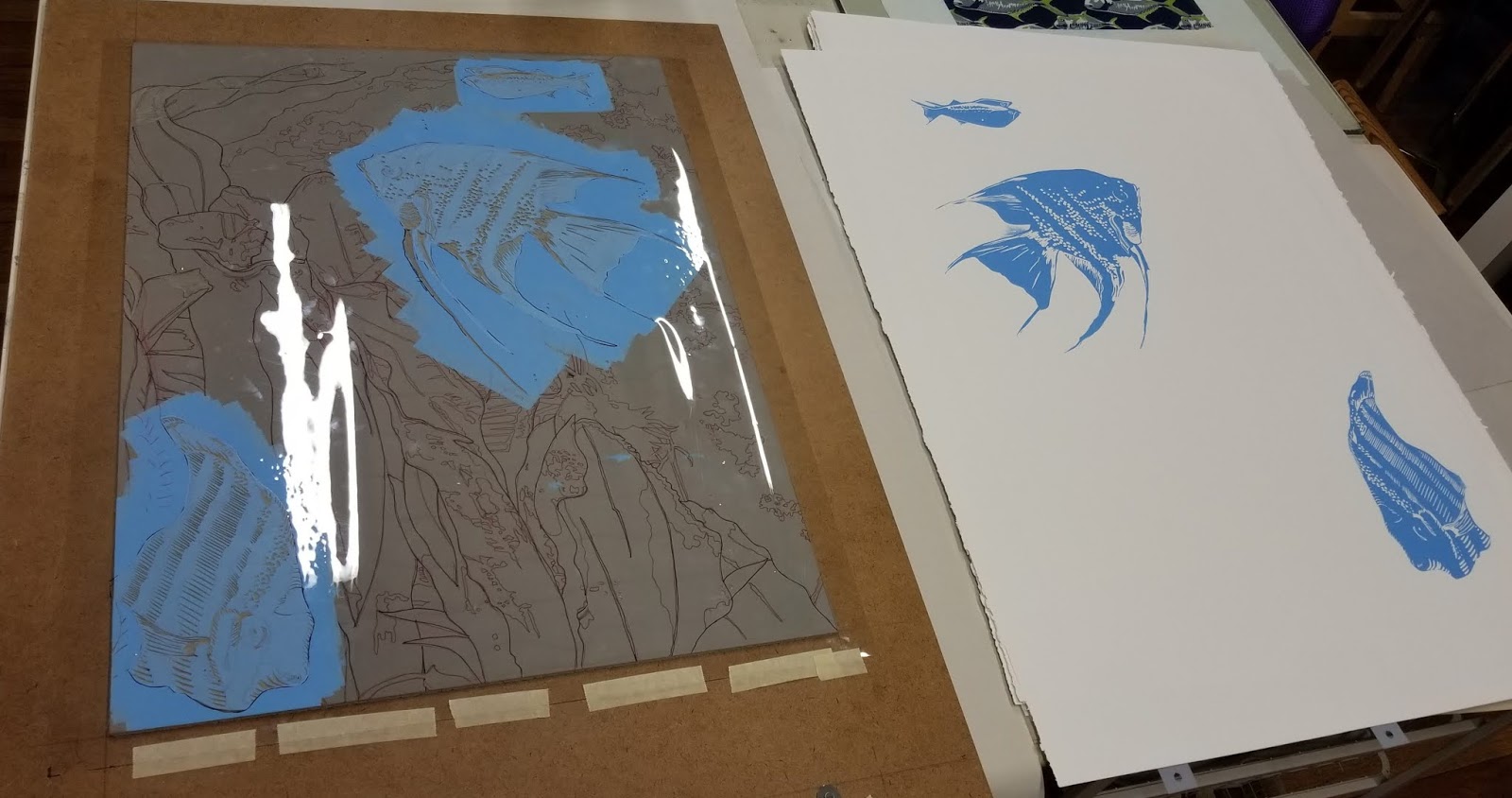
I weighed whether to start printing with the light blue or the yellow. You can't get yellow over any other color, but the blue only appeared in the fish. If I printed the whole plate in yellow and attempted to print light blue I would get green, so I cut stencils to block off everything but the fish and printed the blue first. I printed 12 of each plate., using Ternes and Burton pin registrration
 |
| Color 1 |
I printed the yellow next without a stencil but I cut a mask to protect the masonite from stray inking.


The benefit of printing the blue first and then the yellow was the free green I got on the fish. And I got my bright yellow and pure blue where I needed them.
 |
| Color 2 |
I normally determine exactly where each color would go in separate color separations. But working this large made that problematic. And I must say, the Sherrie York process influenced me a tad on this project. (See her blog Brush and Baren.) Because I had drawn the entire line drawing on each plate at the beginning, I drew in the areas I wanted to save as yellow and then cut that away and printed color 3.
I was printing in my home studio and it has been monsoon season which means it is a bit more to a lot more humid depending on the day. After I printed color 3, I ran into problems and had to reach out to Santo Press master printer Brent Bond for advice. I turns out that the humidity had stretched my paper on this print with the large angelfish. The upper right corner stretched a bit above the straight and narrow.
 |
| Color3 |
I didn't see it until I was in to printing the 4th color. I had good luch with the second image but the first one was super stretching and it was raining outside. I was using a tympan, the pressure was too tight and my registration was wonky - and I was using pins! So I took Brent's advice and stopped that night and tried again the next day with less pressure and a single blanket and I was back in business. Phew! Because it was starting to look pretty darn good.

 |
| Color 4 |
At this stage was I wearing myself out, so I enlisted the help of a fellow printmaker, Paulette Olive, to help me with the heavy lifting - actually lifting the plates on and off the press. It was much faster and way more fun sharing the studio. Each color took about 6 to 8 hours to print (25 in all). After carving away color 4 and printing 5, I briefly considered ending there. It looked so good. But I wanted to bring in more depth so I continued on with color 6.

 |
| Color 5 |
After color 6 I hand colored the orange around the eyes because I never could figure out how to do it earlier. Et voila!
 |
| In Deep I and In Deep II |
This is the exhibition view, pardon the light reflections at the top. Final curating allowed an edition of 7.

